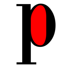
An aperture is a region of a letter that is fully or partially limited by the shape of a letter or symbol. [1] [2] Letters of the Latin alphabet containing closed apertures: A, B, D, O, P, Q, R, a, b, d, e, g, o, p and q. Letters containing open apertures: c, f, h, i, s, etc. The numbers 0, 4, 6, 8, and 9 also have apertures.
A hole is the space between the aperture and the outer border of the symbol.
Open and Closed Holes
Different fonts use different open or closed holes. This design decision is especially important for sans-serif fonts that can have very wide lines, which makes the holes very narrow.
Fonts designed for text legibility often have very large open apertures, widely separated from each other to reduce ambiguity. This can be especially important in situations where the text will be viewed at a distance, in texts intended for viewing by people with vision problems, or for small print, especially on poor quality paper. [3] Open aperture fonts, such as Lucida Grande , Trebuchet MS , Corbel, and Droid Sans , are intended for use on low-resolution displays, while Frutiger , FF Meta, and others are for use in print. [four]
Sans serif neo-grotesque fonts, such as Helvetica , use open holes that are very close to closed, drawing the ends of the lines together. This gives the font symbols a peculiar, compact appearance, but can lead to the fact that such forms of letters are difficult to distinguish from one another. Closed-letter characters in fonts such as Impact and Haettenschweiler make characters like 8 and 9 almost indistinguishable with small print sizes. Designer Nick Shinn suggested that the reason for this design trend, similar to Didone serif fonts in the nineteenth century, may have been a desire to distribute the pressure of the printing press, reducing wear. [5] [6]
Notes
- ↑ John Maxymuk. Using desktop publishing to create newsletters, handouts, and Web pages . - Neal-Schuman, 1997. - S. 33. - ISBN 978-1-55570-265-6 .
- ↑ Sumita Narang. Designing Websites: According to the Ancient Science of Directions . - Smita Jain Narang, 2006 .-- S. 74. - ISBN 978-81-207-3071-7 .
- ↑ Mercury Text: Features . Hoefler & Frere-Jones (November 28, 2014).
- ↑ Billy Whiter. Three Exemplary Typefaces for User Interfaces . The Typekit Blog . Adobe (November 28, 2014).
- ↑ Nick Shinn. Modern Suite . Shinntype (August 11, 2015).
- ↑ Martin Majoor. My Type Design Philosophy .